| AI Web Mobile (English) |
 |
 |
|
(English| ภาษาไทย)
With Mobile First development and Bootstrap CSS library, you first create webpage for small screen size then make it bigger later on. This assure your webpages could display properly on any screen.
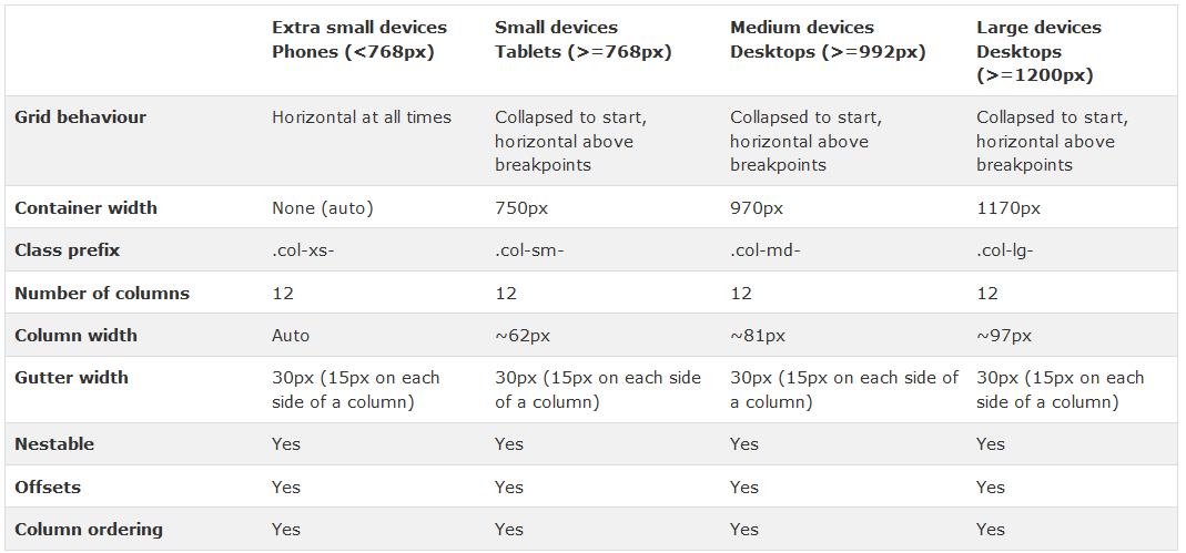
Smart devices have various screen sizes. Bootstrap defines screen size as XS, SM, MD, LG
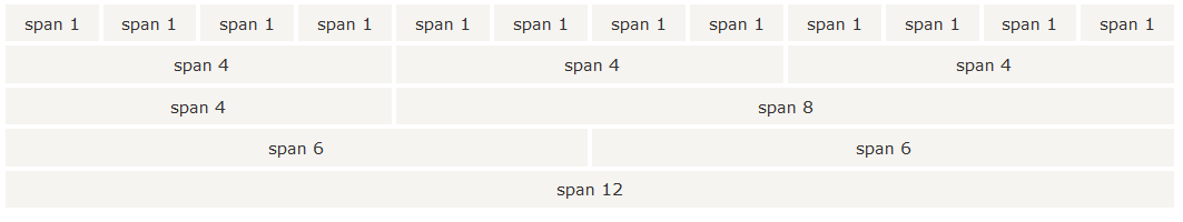
Content flow will format as 12 column a row.
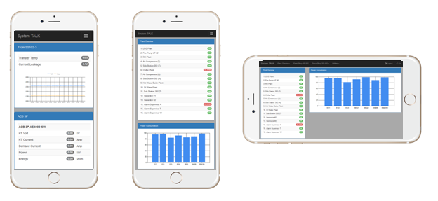
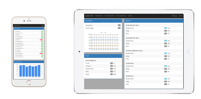
Final result would fit both smart phone and tablet.
|